
Miniature Train Park A.V.V.F.

A.V.V.F. (Association Vapeur Vive Fribourgeoise) is a new miniature train park that's being built in Fribourg, Switzerland. The park focuses primarily on train aficionados but aims to attract a fair share of tourists as well. As a result, the logo needed to be accessible yet detailed.
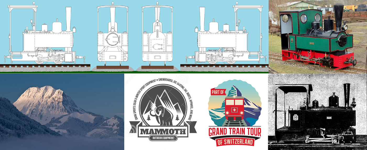
The elements that needed to be included were fairly strict. The train in the upper right corner above was built by the owners themselves and it needed to be the 'posterboy' of the park. The area is also known for a very distinctive mountain, the Moleson, and is used in every regional logo. They also wanted a classic badge-type logo with both the acronym and the full name at the circumference.

The level of detail in the train required multiple iterations to get right, and the need to appeal to two disparate groups caused a conflict in the design. The solution in the end was to avoid details as much as possible in the most striking surfaces: the red and green body of the train, and use the 'shadow color' black to include the details for those willing to examine the logo.

The colors needed to match those of the original train the owners built, but there was some freedom in the hue and intensity. Because A.V.V.F. is located in Switzerland, I chose to use a bright red which, when combined with the white 'hole' in the lower part of the train, gives of a Swiss feeling. To keep the logo legible I muted the green significantly while avoiding it becoming so dark it merged with the black elements surrounding it.

Due to the immense level of detail in the train, the remaining elements needed to be very simple and neutral. The Moleson is known for it's distinctive outline, so the backdrop became a simplified version of this outline on white to show the snowy peaks Switzerland is famous for. The banner similarly needed to be as simple as possible, and the mountain needed a solid base to rest on. The rectangular design solved both concerns in one go.

The owners had a specific typeface in mind that they wanted to incorporate into the design. The typeface in question, Bocklin, isn't suited for use in logos that need to be scaled both larger and smaller as it is very detailed. The three typefaces above are the alternatives I presented, and each showcases a different aspect of the old-school train feeling they were looking for while not hurting legibility with an abundance of details.

The end result when all put together. The full name is used to indicate the circular form of a badge logo without adding more detail to the whole of the design. The train is the central highlight with the remaining elements framing and grounding it.

A couple of examples of the logo's application on merchandise. The logo is fairly modular and various elements can be removed to adapt it to the circumstances in which it is applied.


